A chart on a decentralised exchange is not the same object as a chart on a regulated venue. It is drawn from the trades that happened in one pool, and a single trade can draw a candle that looks like a trend. Learning how to read a DEX chart is mostly about knowing what the picture cannot tell you.
These seven checks on how to read a DEX chart take a few minutes and are worth running before any purchase in a pool you have not traded before.
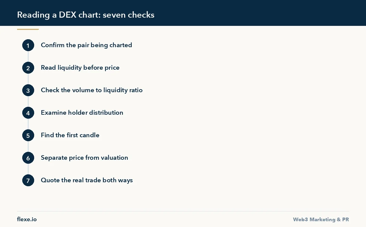
1. Confirm which pair the chart is drawing
Charting sites default to the pool with the most activity, which is not always the pool your trade will route through. A token quoted against a wrapped native asset and the same token quoted against a stablecoin will show different prices, and during volatile hours they can differ noticeably.
Check the pair label, the chain, and the exchange name in the header before reading anything else. If the pair is not the one your swap will use, the chart is describing a different market.
2. Read liquidity before price
The size of the pool decides how much of the chart is real. In a thin pool, a modest buy moves price several percent, so the candles record the size of individual orders rather than any change in what the market thinks the token is worth.
Compare pool liquidity against the amount you intend to trade. If your order is a meaningful fraction of the pool, you are not reading the price, you are about to set it.
3. Look at the ratio of volume to liquidity
Daily volume many times larger than the pool that produced it is a signal, not an achievement. Genuine turnover at that ratio is rare outside stable pairs, and the usual explanation is a small number of addresses trading against themselves to make the chart move.
The transaction list underneath the chart settles it. Real activity has irregular sizes at irregular intervals from many addresses. Manufactured activity has repetition: similar amounts, even spacing, a handful of wallets.
4. Count the holders and read the top of the list
Open the token in a block explorer and look at the holder distribution. A few addresses holding most of the supply means the chart is a courtesy: whatever it shows, the exit price is decided by whether those addresses sell.
Check what the largest holders actually are. A locked contract, a bridge, or a known exchange wallet is different from a fresh address funded shortly before launch. Explorers label the ones they know, and an unlabelled top holder deserves a minute of attention.
5. Find the first candle
Zoom all the way out. The age of the pool changes the meaning of everything above it. A chart with three days of history has no support levels, no ranges and no trend, whatever shapes appear on a five-minute view.
Also note whether the whole visible history sits above the launch price. New pools frequently show an early spike that no participant could have traded, produced by the first buys against near-zero liquidity.
6. Separate price from market capitalisation
Charting interfaces show a market capitalisation figure derived from circulating supply, and circulating supply is frequently self-reported. Where the true number is larger, the valuation on screen is understated by however much has not been counted.
Compare it against fully diluted valuation on the same page. A wide gap tells you a large share of supply has yet to arrive, and the schedule for that supply matters more to the next month of price than any pattern on the chart.
7. Quote the trade before you believe the price
The last check is the decisive one. Enter your actual size in the swap interface and read the price impact and the amount received. That number, not the chart, is the price available to you.
Then quote the reverse trade for the same amount. If selling back moves the price far more than buying did, the pool is one-sided and the chart’s recent rise reflects buying into thin depth. The full procedure is in our guide on how to buy altcoins on a DEX.
Set the interface up before reading
Before looking at the shape, fix what the chart is denominated in. Sites toggle between price and market capitalisation, and between the quote asset and a display currency, and the same pool looks like a different market under each. Pick price in the quote asset for reading the pool itself, and switch to the other views deliberately rather than inheriting whatever the site remembered.
Set the timeframe to something you can reason about. One-minute candles on a pool with a few dozen trades an hour draw noise with gaps in it, which the eye reads as structure. Start on a daily view to see the whole history, then move down only as far as the trade frequency justifies going.
Check what the site is doing with the pool selector as well. Some interfaces aggregate several pools into one chart and label the result with the token name alone, which hides the fact that the depth you are reading sits in a venue your swap will never touch. Where the site names a specific pool, keep it selected for the session, because changing the timeframe can quietly reset it to whichever pool is busiest.
How to read a DEX chart quickly
Under time pressure the order is what saves you. Confirm the pair and the chain, look at pool size, read the transaction list, then quote your actual trade. The shape of the candles comes last, and in a thin pool it rarely changes the decision. Everything earlier in that sequence is a fact you can read in seconds, while the pattern is an interpretation you are supplying yourself.
If any check is ambiguous, stop rather than compensating with a smaller size. A pool you cannot identify, a holder list you cannot read because the explorer is behind, or a quote that will not populate are all reasons to wait. The occasions when these checks are hard to run are the occasions when they matter most.
Reading the transaction list properly
The list under the chart is denser than the chart. Watch the ratio of buys to sells across a window long enough to contain both, and look at whether the sellers are the same addresses as the earlier buyers. A pool where every seller bought minutes beforehand is describing activity that will end the moment that behaviour stops, whatever the candles above it suggest.
Follow one or two of the larger addresses into the explorer. What matters is when the address was funded, what funded it, and whether it holds anything else. An address created shortly before the pool and funded by a single transaction behaves differently from one with a history, and the difference takes a minute to establish.
Confirm the token, not the ticker
Tickers are not unique and charting sites list whatever has been deployed. Copy the contract address from the chart page and check it against the project’s own documentation or a verified profile, rather than the other way round, because a search on the name returns an imitation as readily as the original and both will have a chart.
Then open the contract in the explorer and look at whether the source is verified and when it was deployed. A pool trading against an unverified contract deployed the same week is not automatically fraudulent, but it is a different kind of decision from one you can read. The chart looks identical in both cases, which is the point of running the check.
What the first hours look like
A new pool draws shapes no later chart can repeat. The first candle spans whatever range the earliest buys created against near-empty liquidity, so the visible high is frequently a price at which almost nothing traded. A percentage move measured from that point is arithmetic performed on an artefact, and it appears in screenshots constantly.
During the first hours the useful figures are pool depth and whether it is growing, the rate at which distinct addresses are arriving, and whether the liquidity is locked. If you cannot establish those, the chart will not tell you anything that waiting another hour would not tell you more cheaply and with less exposure.
Cross-checking against a second source
Charting sites index pools independently and they disagree: a different pool chosen as primary, a different circulating figure, a different volume window. Open a second site and compare the pool address rather than the picture. Where two sites agree on the pool and disagree on volume, the difference is usually the set of pools each of them is including in the total.
Treat any figure only one site reports as unverified until it can be sourced on the chain. Holder counts, liquidity locks and supply numbers all come from somewhere, and the explorer is what the others are summarising. Going to it takes longer, and it is the only step that settles a disagreement rather than adding a third opinion to it.
The same token on several chains
A token deployed or bridged to more than one chain has a chart per chain, and those are separate markets with separate depth. The one in front of you may be the smallest of them. Check where the liquidity actually sits before concluding anything about the token from the pool you happened to open first.
Prices between chains drift, and a gap is not automatically an opportunity, since moving between them costs a bridge transfer, waiting time and a second swap. For a buyer the practical consequence is simpler: trade where the depth is, and verify that the contract on that chain is the one the project acknowledges as its own.
Record what you checked
Keep a short note per pool: the pool address, its size when you looked, the top holders, and the quote you received for your intended size. It takes a minute and it turns the next visit into a comparison rather than a fresh reading. Changes between two snapshots are considerably more informative than either snapshot on its own.
The comparison catches the slow versions of the problems above: liquidity withdrawn gradually, a top holder distributing steadily, volume drifting down while the price holds. None of those are visible in a single look at the chart, and each of them changes what the next trade should be, or whether there should be one.
Reading your own token’s chart
Teams read their own chart last and defensively, which wastes the most useful view available to them. Run the checks a buyer runs, in the same order, and write down what a stranger would conclude from them. The distribution at the top of the holder list and the ratio of turnover to depth are the parts a stranger sees first and remembers.
What can be acted on is depth and disclosure. Publishing which addresses are treasury, which liquidity is locked and until when, and where the official pool is, removes questions that otherwise get answered by guesswork underneath the chart. The chart itself is not a thing to manage, and managing it produces exactly the pattern these checks are designed to catch.
Charts that arrive in your messages
Most charts people act on are screenshots sent by somebody else, and a screenshot removes every check described above. There is no pair label to confirm, no transaction list underneath, and no way to tell which site drew it or when. Open the pool yourself before treating any of it as information, and expect the live view to differ from the image by the time you get there.
Pay attention to what has been cropped. Missing axis labels, a timeframe cut off at the edge, or a view that begins after the first candles are the usual ways a picture is made to look like a trend. If whoever sent it cannot say which pool and which chain it shows, that answer is the only one you actually needed.
Reading through a sharp move
During a fast move the chart lags what the pool is doing, and every interface shows a slightly different price because each is reading a different point in the stream of blocks. Refresh the quote rather than the chart, since the quote is the only figure generated against current reserves and it is the one your transaction will be measured against.
Expect the transaction list to be the clearer surface at that moment. A move produced by one large order looks different from a move produced by many small ones, and the distinction decides whether waiting is sensible. A single order into thin depth reverses often. Many separate addresses arriving together does not resolve as quickly or as predictably.
How to read a DEX chart: what it genuinely tells you
Three things, reliably: whether anyone is trading this pair at all, whether the activity is continuous or arrives in bursts, and whether the current price is far from where the pool spent most of its life. Those are useful. Everything beyond them requires depth the chart does not show.
Technical patterns imported from deep markets assume many independent participants and continuous quoting. A pool with a few hundred thousand in liquidity has neither, so the pattern is describing the behaviour of a handful of addresses rather than a market.
For teams whose token is the one being charted, thin depth and irregular volume are a marketing problem before they are a trading problem, because every prospective buyer runs some version of these checks. The demand side of that is covered on our crypto traffic acquisition page, and the venue side in how to choose a reliable DEX.